I don’t know about you, but when I browse YouTube for educational videos on painting, I come across too many that make me feel like I’m not good enough. Titles like “…you should know…”, “10 things they didn’t tell you…”, “how to be a pro…”, “top 10 mistakes…” – they all give me an uneasy feeling.
Why the emphasis on what the creator knows that I, the viewer, apparently don’t? Can’t it be more supportive? Something like “I’ve got an idea I’d like to share” or “maybe you knew this already, but this was a fun discovery for me”?
Perhaps this is just one of my personal quirks, but I’d like to share a discovery with you. You might already know this technique, but for those who don’t, it might prove helpful.
This week I began painting with oil paint – water-mixable oil paint from Talens called Cobra. Oil painting is completely new to me. I’m used to fast-drying acrylics and even faster-setting encaustics, both totally different from each other and different from oils. I like the challenge of learning something new, though it comes with setbacks, mistakes, failures, and the resulting frustration. Frustration is definitely one of my lesser-developed character traits – something I explore in my book “The Consciousness Cookbook”. Nobody’s perfect, right?
I’ve grown used to fast results, since acrylics and encaustics dry rapidly, letting me move swiftly to the next project. With oils, I need to exercise patience. Or do I?
I’ve had no formal training in sketching, painting, or sculpting. I attended art schools in Rotterdam and Amsterdam but left both without completing my studies. I picked up bits and pieces during foundation years, but not enough to feel comfortable with any of these techniques.
So I need to learn methods that get me where I want to be. Knowing what I want to paint is one thing, knowing how to get there is about skill, experience, and willingness to learn, experiment, and fail.
The Greyscale Overlay Technique
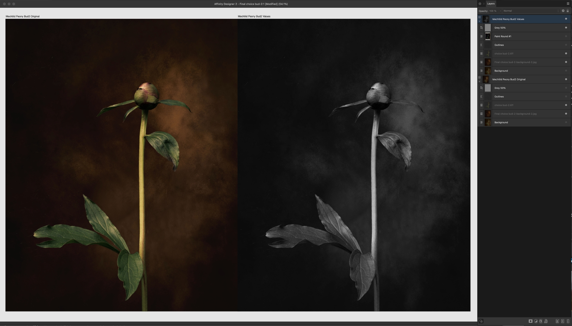
One discovery I made is using a greyscale overlay on my computer or iPad to judge values more easily. The concept of studying values without colour distraction is probably as old as painting itself, but having digital tools makes it so much simpler.
Step One: Compare Reference Photos
Take a colour reference photo and compare it with the same photo where a grey layer is added, set to “Saturation”. This allows you to compare the values – the lightness and darkness.
In the screenshot above, I compare two identical reference photos. On the right, I added a 50% grey layer set to “Saturation”. This removes colour distraction and lets me focus purely on values – the lightness and darkness.
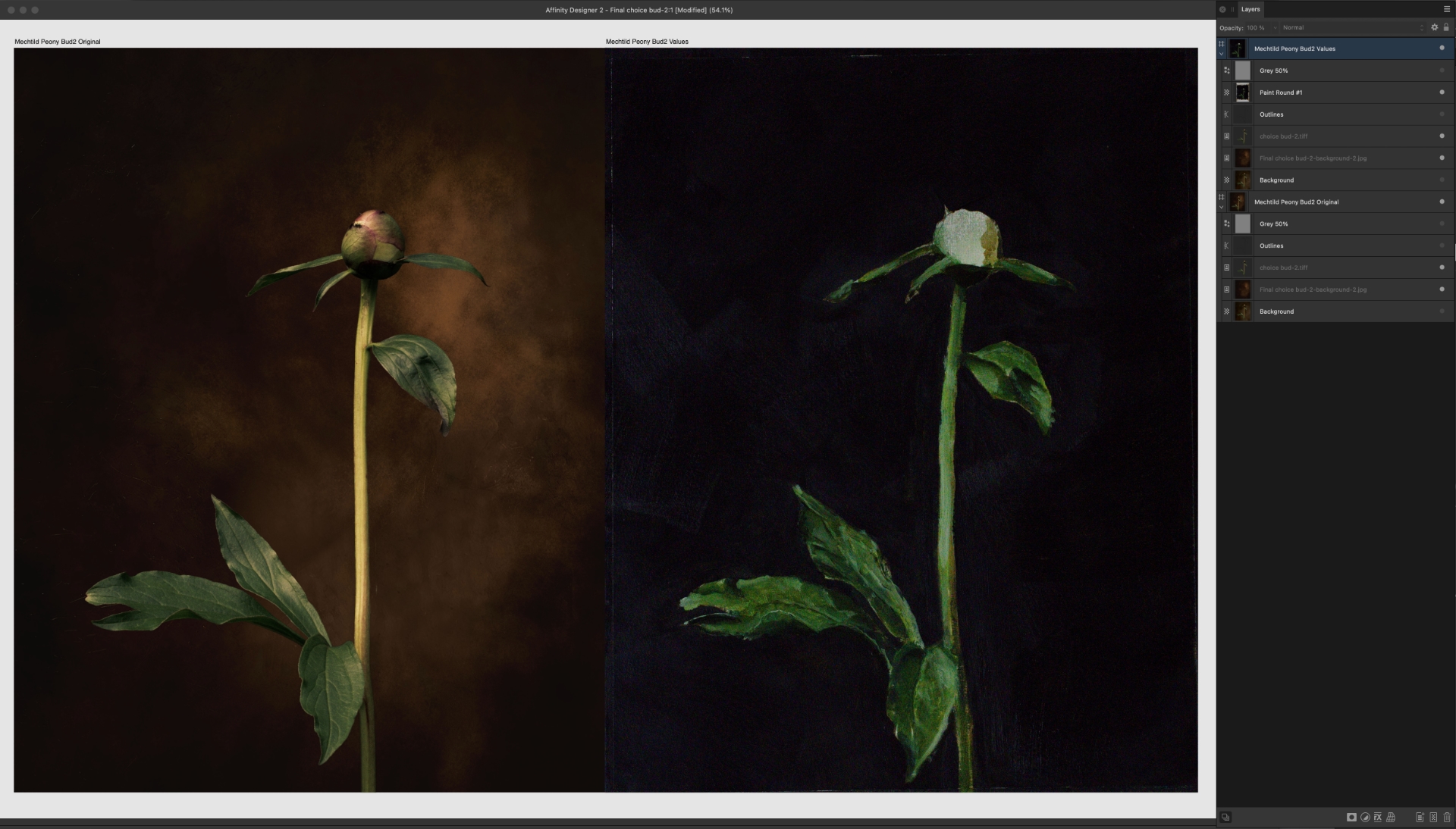
Step Two: Compare with Your Painting
Here’s my painted peony next to the original reference photo. I kept it loose and didn’t worry about too much detail, as that would disrupt my ability to quickly see which areas need attention. I’m not concerned yet if the hues are perfect – I want to get the values right first.
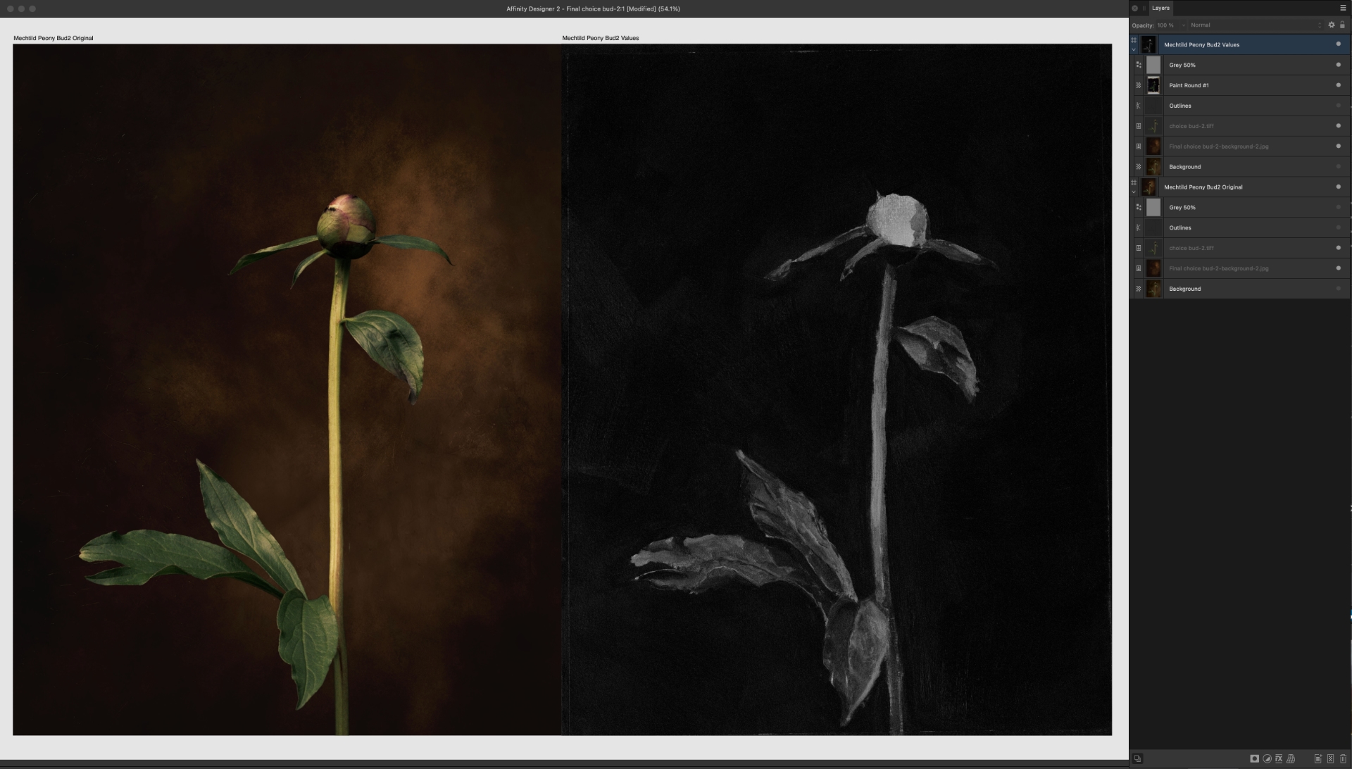
Step Three: Apply Greyscale to Your Work
Compare your colour reference photo with the photo of your initial painting layers, then add a grey layer to both, set to “Saturation”. This allows you to compare the values directly.
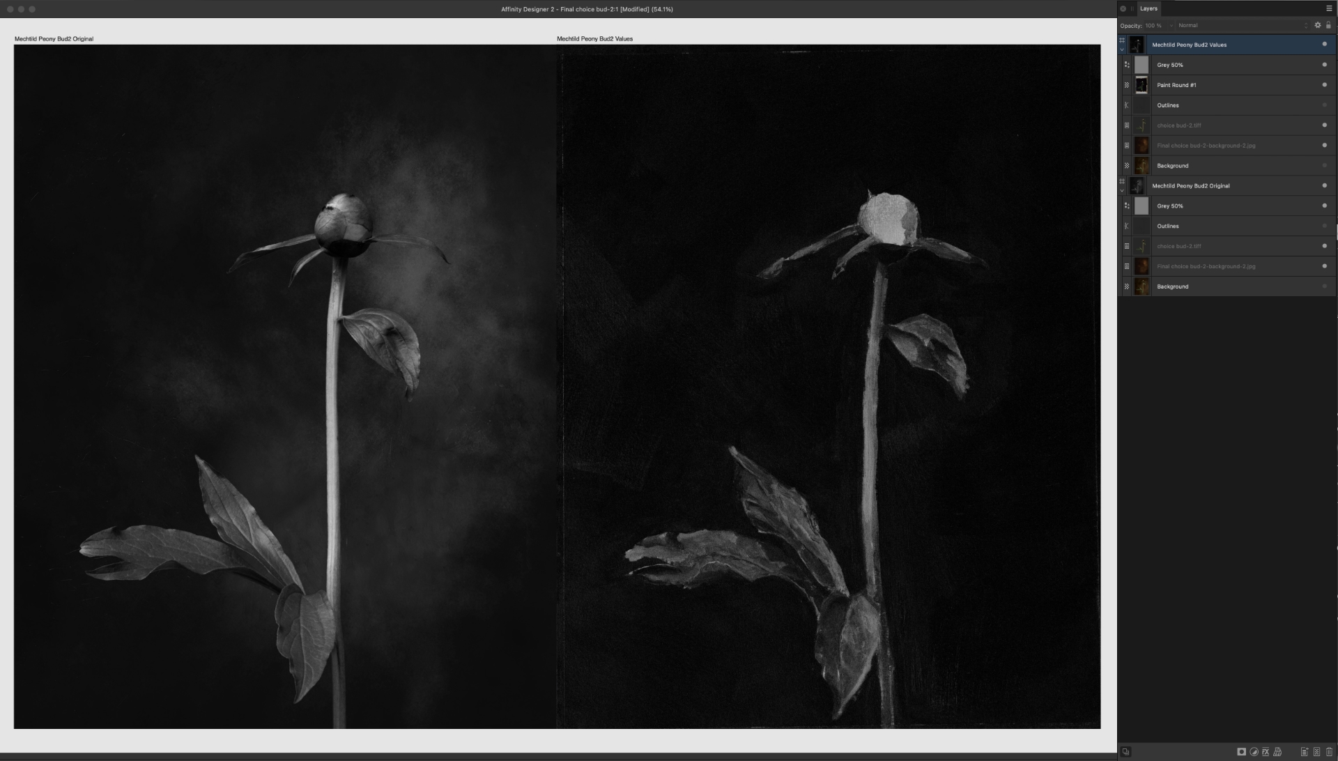
When I add the 50% grey layer to my painting, the differences become quite clear. There are many differences, but as my first attempt with oils ever, I won’t be too harsh on myself.
At this point, I don’t care much how I reach my envisioned result. Spit, fingers, damp cloth – whatever works. My to-do list for this painting is long, and the essence of the story still needs to unfold: those delicate lace petals.
Starting a Second Painting
Another idea I had this morning was to start a second, similar painting alongside this one. Since oil takes time to dry and there’s only so much I can do right now – probably due to my lack of skills and experience – I’ve mounted a second sheet of paper with the first layer of gesso.
As my oil painting dries slowly, and I want to continue painting, I started a new canvas (paper and gesso) on the right side.
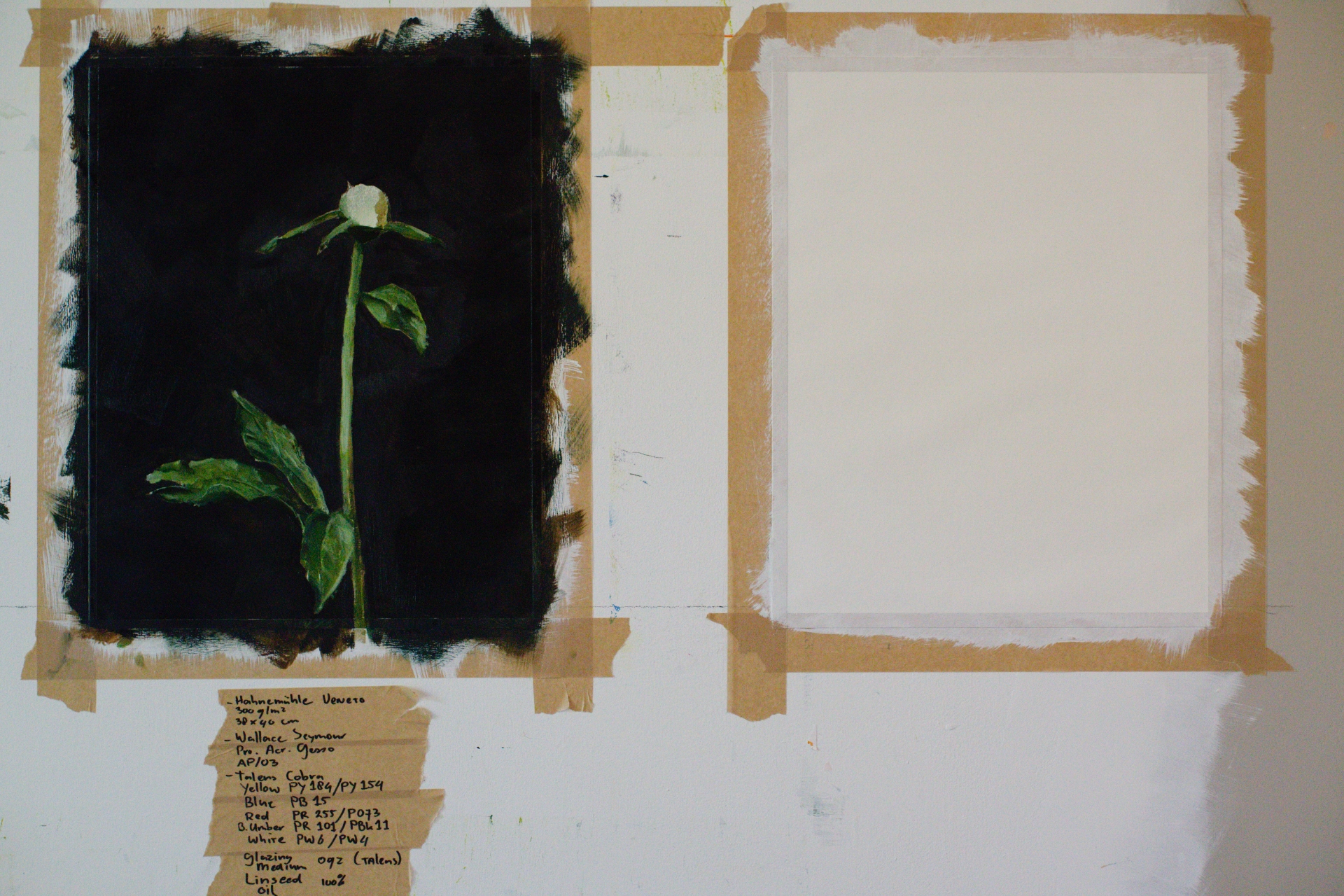
Below the painting in the photo, you’ll see the materials I’m using for this painting. I find it handy to keep track, and I’ll stick this list on the back of the finished piece.
Materials List
Below the painting in the photo, you’ll see the materials I’m using for this painting. I find it handy to keep track, and I’ll stick this list on the back of the finished piece.
Materials used up to this moment:
- Hahnemühle Veneto 300g/m²
- 38 x 40 cm
- Wallace Seymour – Pro Acrylic Gesso AP/03
- Talens Cobra
- Yellow PY184/PY154
- Blue PB15
- Red PR255/P073
- Burnt Umber PR101/PBK11
- Zinc White PW7/PW4 (was Titanium White PW6/PW4)
- Glazing Medium 02
- Linseed oil 100%
The point isn’t to follow rules or do things “correctly”. It’s to experiment, discover, and keep creating – even when you’re starting from almost zero like me.
Take notice of the kinds of fears that arise when you want to start something creative but can’t seem to get started. What excuses do you make? Lack of time, lack of money, needing this or that specific tool first? In essence, you can take the back of any envelope, use some leftover coffee, tea, or any liquid that leaves a stain, and begin to paint.